 Print
Print
This article describes how to build a Publish Queue Viewer application that allows viewing the list of Items changed since the previous publishing and waiting to be published.
1. Introduction
This installation starts right where the previous article, “My First XAML Application”, ends. If you haven’t read it and are not familiar with XAML programming concepts, it is strongly advised that you read it first.
We will build a publish queue viewer application. It will allow us to see the list of Items changed since the previous publishing and still awaiting to be published. This article is educational for the most part. It describes how to create a real-world application and work with advanced controls. However, the application itself is fully functional and can be used in the everyday work.
Note: if you’re only interested in using one or several techniques or controls and have no time to read the whole article, please read the Implementation section to see which control is used for which purpose and then navigate to the section of your interest.
1.1. Sample Code
The examples used in this article are available for download. We recommend creating the objects and typing in the code yourself, as this will help you understand the material. However, if you are short of time, you can simply install the “PublishQueueViewer” package (available in the package folder) and have it all ready in seconds. You can also use it later on if you actually need a Publish Queue Viewer application.
The PublishQueueViewer.zip Sitecore package will add the “SDN5 Samples” folder to the Sitecore menu. This menu will include the “Publish Queue Viewer” application. If you find the application useful, you can move it to Administrative Tools folder or somewhere else.
The heavily-commented source code is also included. We recommend that you use Visual Studio .NET for viewing and modifying the code; however, nothing prevents you from using your favorite text editor and the cs.exe compiler available in the .NET Framework SDK.
Note: The article itself doesn’t include ‘checkpoints’, that is it doesn’t tell you when to save, compile and inspect the results. It is advised that you do it at least once per each control added
2. Application Design
First, we will define the problem we plan to solve with this application in order to list the requirements and then decide which controls will be used for which purpose.
2.1. The Problem
Our goal is to create an application that will allow Users to see the list of Items that will be published upon the next Incremental Publishing procedure, that is the list of Items that were changed since the last publishing and which do qualify for publishing (keep in mind the Publish/Unpublish date, Lifetime and publish restriction).
The Sitecore API has a number of useful methods to access the required data. This method will be the main source:
public ID[] GetPublishQueue(DateTime from, DateTime to);
The method returns IDs of all Items eligible for publishing for the given time period. Thus our first requirement is as follows: We need to provide means for a User to set the ‘from’ and ‘to’ dates. Then we need to apply some custom logic to filter the Items and display the results. The actual use of the Sitecore publishing API is beyond the scope of this article, so feel free to look through the PublishHelper class in the examples for the article if you’re interested. The class itself is also documented.
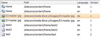
The second requirement will be to display the actual list of Items along with some information, like their path, version and language. In addition to this, we would also like to use a separate control to visualize the location of those Items in the content tree.
The next task will be to create more generic User interface goals: provide a convenient way of interacting with the application.
2.2. Implementation
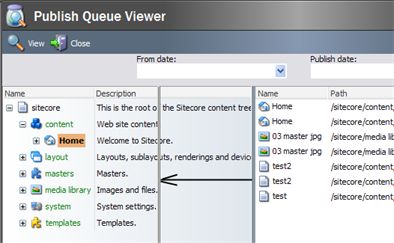
We will use a time machine to look at the completed application to give the overview of controls used.
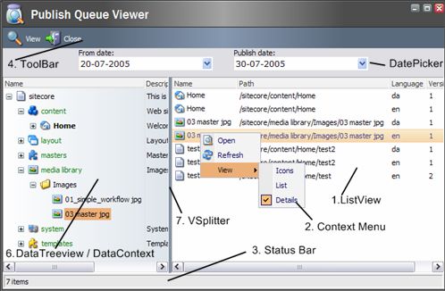
- A Listview control is used to display the list of Items to be published
-
A Context Menu supplements Listview, allowing some additional operations, like opening the selected Item in the Content Editor or changing appearance of the list view.
-
A Status bar displays the number of Items currently in the Listview.
-
A Toolbar provides access to application-wide functions.
-
Two DatePicker controls allow Users to select the time interval.
-
A DataTreeview paired with a DataContext visualizes the Item’s location in the content tree. When a User selects an Item in Listview on the right side, the tree view automatically shows the Item’s position in the content tree.
-
A VSplitter allows a User to distribute the “screen real estate” between the TreeView on the left side and ListView on the right.
Next sections will guide you through all the controls listed above. For better understanding, you should read them in order.
3. Listview
Listview is the main control of the application. It displays the list of Items to be published and provides some interaction with them, for example, double clicking the Item will open it in the Content Editor.
3.1. Adding the Listview
First of all, we will add the Listview control itself:
…
</ListView>
We want to display the Item’s name along with the additional properties, such as its path, language and version. To perform that in XML terms, add the <ListviewHeader> element and populate it with the ListviewHeaderItems:
<ListviewHeader>
<ListviewHeaderItem Name="name" Header="Name" />
<ListviewHeaderItem Name="path" Header="Path" />
<ListviewHeaderItem Name="language" Header="Language" />
<ListviewHeaderItem Name="version" Header="Version" />
</ListviewHeader>
</Listview>
As both the number of Items and their path can become pretty big, we also want to handle scrolling properly – wrap the Listview control in the ScrollBox:
<Listview ID="ItemList" View="Details" Width="100%" Background="white">
…
</Listview>
</Scrollbox>
We’ve finished the declarative part of adding the Listview control. Switch to the code-beside class to populate Listview with Items.
3.2. Populating the Listview
As with any task performed in the code-beside class, the first step is to reference the control itself:
Now we will create a method that fills the Listview with an array of Items. At this point it doesn’t matter where the Items came from.
if (items == null) return;
foreach(Item item in items)
{
// Create and add the new ListviewItem control to the Listview.
// We have to assign an unique ID to each control on the page.
ListviewItem listItem = new ListviewItem();
Context.ClientPage.AddControl(ItemList, listItem);
listItem.ID = Control.GetUniqueID("I");
// Populate the list item with data.
listItem.Header = item.Name;
listItem.Icon = item.Appearance.Icon;
listItem.ColumnValues["path"] = item.Paths.Path;
listItem.ColumnValues["language"] = item.Language.Name;
listItem.ColumnValues["version"] = item.Version.ToString();
}
}
Now we have to add the parent method that will call FillItemList and pass the right data to it.
{
// Clear the Listview control and populate it with items awaiting
// for publishing
ItemList.Controls.Clear();
Item[] items = publishHelper.GetPublishingItems(Start, End);
FillItemList(items);
// We need to replace the html in order to avoid duplicate ID's
Context.ClientPage.ClientResponse.SetOuterHtml("ItemList", ItemList);
}
As mentioned above, we’re using the PublishHelper class as a black box. The actual logic of getting the list of Items in publishing queue is beyond the scope of this article.
3.3. Handling Events
We would also like to provide some way to interact with the Users. When a User double clicks on an Item, we will open the Content Editor with the Item selected. To achieve this, you should do the following:
- Add the ‘DblClick’ attribute to the Listview and set it to ‘OnOpen’ <Listview ID="ItemList" View="Details" DblClick="OnOpen" …>
- Add the OnOpen method to the Code-Beside class.
protected void OnOpen()
{
// Ensure that the user has selected an item in Listview
if (ItemList.SelectedItems.Length == 0)
{
Context.ClientPage.ClientResponse.Alert("Please select an item first");
return;
}
// Extract the values from the selected Listview item
ListviewItem selectedItem = ItemList.SelectedItems[0];
Item current = source.Items[selectedItem.ColumnValues["path"] as string];
string id = current.ID.ToString();
string language = selectedItem.ColumnValues["language"] as string;
string version = selectedItem.ColumnValues["version"] as string;
// Open the item in content editor
OpenInternal(id, language, version);
}
The OpenInternal() method uses the internal communication system to open the Content Editor with the given Item selected. Please browse the source code if you’re interested in this technique, it is only 6 lines long.
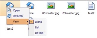
To provide even more ways of user interaction we will add the ContextMenu control and bind it to the Listview.
4. Context Menu
We’ve already implemented the methods that will be called from the Context Menu and want to provide another way of interacting with the application.
- First, declare the Context Menu: <ContextMenu ID="FileListContextMenu">
</ContextMenu> -
To instruct the Listview control to popup the context menu when needed (that is when it is right-clicked by a User), add the following attribute to the Listview declaration:
ContextMenu="show:FileListContextMenu" -
Populate the context menu with Items. Again, all declarative:
<ContextMenu ID="FileListContextMenu">
<MenuItem Icon="Applications/16x16/document_view.png" Header="Open"
Click="OnOpen" />
<MenuItem Icon="Applications/16x16/refresh.png" Header="Refresh"
Click="Refresh" />
<ListviewViewsMenuItems Listview="ItemList"/>
</ContextMenu>
The first two Items are regular menu Items – the Icon and Header attributes set the appearance, and Click defines the action. Since we’ve already added the OnOpen and Refresh methods, we don’t need to add anything to the code-beside class.
ListviewViewsMenuItems is a special menu control that allows a User to modify the appearance of the Listview control. We’ve set it to be “Details” by default in ListView declaration. However, this menu will allow a User to choose from ‘Icons’, ‘List’ and ‘Details’ options.
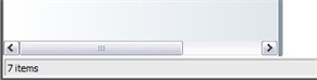
5. Status bar
There’s no built-in status bar control, but it can be easily emulated by a few lines of XAML markup:
<Border Height="22" GridPanel.Height="22" Background="#e9e9e9">
<GridPanel Columns="1" Width="100%" Height="100%" CellPadding="2">
<Border Border="1px inset" Padding="2" Height="100%">
<Literal ID="NumberOfItems"/>
</Border>
</GridPanel>
</Border>
After that, add the literal to the code-beside class:
And update the FillItemList() method that fills the Listview control:
{
NumberOfItems.Text = items.Length.ToString() + " items";
}
else
{
NumberOfItems.Text = "1 item";
}
The status bar will show the number of Items in the list view.
Note: To add more sections to the status bar, simply increase the number of columns in the Grid Panel and add more <Border /> elements.
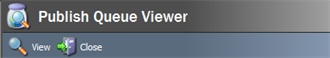
6. Toolbar
The Toolbar is another widely used UI element.
<Toolbutton Header="View" Icon="applications/32x32/view.png” Click="local:show" />
<Toolbutton Header="Close" Icon="applications/32x32/exit.png" Click="local:close" />
</Toolbar>
This example uses the regular toolbar control. Each button is defined by the ‘Toolbutton’ element and sends a certain message handled in code-beside:
protected void Show(Message message)
{
Refresh();
}
[HandleMessage("local:close")]
protected void Close(Message message)
{
Windows.Close(CloseMethod.CloseWindow);
}
The regular toolbar is simple and easy to use, but in the real-world complex applications, you might want to use the AutoToolbar control. It automatically populates its buttons from the content structure, that is each button is defined by the content Item instead of the element in the declarative markup. It takes longer to set up, but then you benefit from the Sitecore architecture: each button can be easily localized, and you can manage the button visibility using the security model.
7. DatePicker
To allow users to select a specific time interval we will use two DatePicker controls:
<Border Align="Center" Padding="0 0 8 0">
<GridPanel Columns="3">
<Literal Text="From date:" Click="Refresh" GridPanel.VAlign="top"/>
<Space Width="32"/>
<Literal Text="Publish date:" Click="Refresh" GridPanel.VAlign="top"/>
<DatePicker ID="StartDatePicker" Width="200" />
<Space Width="32" />
<DatePicker ID="EndDatePicker" Width="200" />
</GridPanel>
</Border>
</Border>
The ‘Start’ and ‘End’ properties provide access to the date picker values, since DatePicker stores its value in ISO date format, but the publishing API requires DateTime parameters.
protected DatePicker EndDatePicker;
protected DateTime Start
{
get
{
DateTime defaultDate = source.Properties.GetLastPublishDate(target, Context.ContentLanguage);
return DateUtil.IsoDateToDateTime(StartDatePicker.Value, defaultDate);
}
set
{
StartDatePicker.Value = DateUtil.ToIsoDate(value);
}
}
protected DateTime End
{
get
{
DateTime defaultDate = DateTime.Now.AddDays(1);
return DateUtil.IsoDateToDateTime(EndDatePicker.Value, defaultDate);
}
set
{
EndDatePicker.Value = DateUtil.ToIsoDate(value);
}
}
The date of the last similar publishing is used as a default beginning date, and the next day is used as an end date.
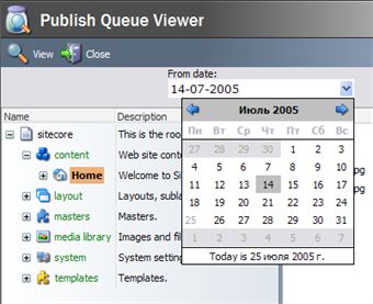
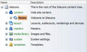
8. DataTreeview
In our application, the DataTreeview control visualizes the Item’s location in the content tree. When a User selects an Item in Listview on the right side, the tree view automatically shows the Item’s position in the content tree.
In
section 3
,
we’ve manually created ListviewItem objects to populate the listview control. This section illustrates a different approach: using DataContext and data controls. The DataTreeview will automatically populate itself with children basing on associated DataContext.
8.1. DataContext
DataContext is added just as any other control, despite the fact that it is invisible to the end user:
We will setup the data context to show all Items in the master database, that is all children of the ‘/sitecore’ Item. The following code is added to the OnLoad() method:
{
TreeviewDataContext.DataViewName = "Master";
TreeviewDataContext.Root = source.Items["/sitecore"].ID.ToString();
}
Dataview is an essential component used by data context internally to navigate Items. There is MasterDataView that is used to navigate regular Sitecore databases (along with the RecycleBinDataView subclass, DomainDataView and FileSystemDataView).
Dataviews are registered in web.config:
<dataview name="Master" assembly="Sitecore.Kernel" type="Sitecore.Web.UI.HtmlControls.MasterDataView" Parameters=""/>
...
</dataviews>
That is why setting DataViewName to “Master” instructs DataContext to use MasterDataView.
8.2. DataTreeview
The DataTreeview control is derived from the regular Treeview control to display Items provided by the data context. Since we’ve set up the data context in the previous chapter, now we need to create DataTreeview and bind it to the data context
<TreeHeader>
<TreeHeaderItem Name="name" Header="Name" />
<TreeHeaderItem Name="__Short description" Header="Description" />
</TreeHeader>
</DataTreeview>
This is similar to defining the Listview and regular Treeview controls: we define the control itself and declaratively populate its header. The only significant difference is that we bind the tree view to the data context. From now on we can forget about the tree view itself and only use the data context to navigate the data, and the tree view will automatically update itself accordingly.
As a final cut, we will add a little eye candy to the tree view, making the Content Editor like gradient to it.
<DataTreeview>
...
</DataTreeview>
</Scrollbox>
Note that the gradient style is actually applied to the embellishing scrollbox control, instead of the tree view itself.
8.3. Handling Events
We’ve set up and initialized the data context, created DataTreeview, and bound it to the data context. At this point, the tree view itself is fully functional – it shows the content tree starting from the /sitecore root Item and can be navigated by the User.
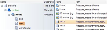
However, there’s still one design goal left – to visualize the location of publish queue Items in the content tree. We will implement the following behavior: when a User clicks on an Item in the list view, the tree view will set focus to the same Item in the content tree, thus effectively showing its location.
To start, we will subscribe to the OnSelectionChanged event of the list view:
protected override void OnLoad(EventArgs args)
{
...
ItemList.OnSelectionChanged += new EventHandler(ItemList_OnSelectionChanged);
}
The actual event handler is simple. All we need to do is to retrieve the Item selected in the list view and then select it in the data context as well.
{
if (ItemList.SelectedItems.Length != 1)
{
return;
}
// Retrieve the item selected in the listview
Item selected = source.Items[ItemList.SelectedItems[0].ColumnValues["path"] as string];
// Set focus to the same item in the datatreeview. We're operating with data context,
// but the tree view will automatically reflect this change
TreeviewDataContext.SetFolder(selected.Uri);
}
9. VSplitter
Vertical splitter control allows a User to distribute space between other User interface controls. We will add it between the tree view and list view controls, thus enhancing the usability of our application.
<Scrollbox ...>
<DataTreeview .../>
</Scrollbox>
<VSplitter ID="Splitter" GridPanel.Width="4" Target="left" GridPanel. />
<Scrollbox ...>
<Listview .../>
</Scrollbox>
</GridPanel>
Notice a few things regarding the usage of VSplitter control:
- It is only supposed to be used inside the GridPanel control
- When using vertical splitter, GridPanel should have the “table-layout:fixed” style attribute set
- Do not forget to increase the number of columns in the GridPanel when adding a splitter. A s plitter is a control like treeview or listview.
- VSplitter should have its ID attribute set even if you do not reference it from the code-beside class. A nice feature of the splitter is that it automatically stores its location on the form for each User, that is the splitter remembers each User’s position, so that each User can have a different form layout. As a result, however, you should always assign an ID to a splitter, so that it can store and retrieve its settings
The Width and Style attributes control the splitter appearance.
The target attribute determines which control will be resized by the splitter. We set target=”left”, so that VSplitter can modify the width of the DataTreeview control if the User changes it using the splitter and load the modified value the next time the application is started (actually not the width of the DataTreeview control itself, but the width of the scroll box containing the tree view). If we change it to ‘right’, the width of the ListView control will be used instead. In this setup, it doesn’t actually matter which one you choose, but since it doesn’t have the default value, you should pick one.
10. Conclusion
The article covered the process of creating a complete production quality application using some of the advanced UI controls like ListView, DataTreeview and DataContext, ContextMenu, ToolBar, DatePicker, VSplitter and Status Bar.
If you still doubt about the advantages of the new XML UI model, consider this:
- I t took only 80 lines of the declarative markup and about 200 lines of the code-beside event handling code (excluding the use of API publishing), all heavily commented and highly reusable.
- The application provides a rich user interaction, but yet we haven’t written a single line of the JavaScript code.
- We’ve inherited the stylish look and feel of Sitecore UI without any extra effort.