Change the layout of a page
Use the divider and column and row splitter to change the layout of your page.
SXA layouts use a responsive grid layout. Depending on the grid you use, pages are divided into columns. By using row and column splitters or by changing the grid settings, you can determine the page structure and divide the available space horizontally and vertically.
When you create a page in SXA, by default it includes the basic layout that contains three placeholders: header, main, and footer. Especially for adding partial designs, you can use the splitters to turn this basic layout into the layout that you need.
To use the Splitter (Column) rendering to change the layout of the page:
On the page that you want to structure, from the Toolbox, drag the Splitter (Column) rendering to the page.

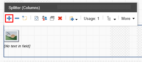
Use the floating toolbar to distribute the grid columns. For example, divide the placeholder into two groups: four columns on the left and eight on the right.
Now you can add renderings to the placeholders you created. For example, drag the Image (Reusable) rendering to the left four columns to add a logo.
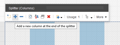
To divide the groups of columns differently, click Add a new column at the end of the splitter. For example, to create a page that lists three products next to each other, add a placeholder to have three sections of four columns.

Note
To increase or decrease the number of rows on a page, in the Experience Editor, drag the Splitter (Row) rendering to the page and use the floating toolbar. You can also further embed splitters in it to subdivide the rows or just add other renderings directly in the rows.
You can also change the layout of your pages by changing the grid settings of the renderings.