Path Analyzer maps
The Path Analyzer is an application that allows you to view the various paths that contacts take as they navigate through your websites. You can see the paths that contacts take when they interact with campaigns, giving you an insight into which paths provide the best engagement value per conversion, and which paths are less efficient and could use optimization.
Maps are a visual representation of the paths that contacts take through your website. Maps consist of three basic elements:
Tree
Path
Nodes
The tree is the basic structure of a Path Analyzer map. A tree consists of many paths, or branches, radiating out from the map's central node. This central node is also known as the tree node.
Paths consist of groups of nodes that represent the sequential pages that contacts have interacted with on their way from specific channels or campaigns, or to particular goals or events. Two or more contacts must have had the same sequence of interactions for a path to be created.
When you view a map, you can switch between the following view modes: Radial, Vertical, Horizontal, Table, Dashboard.
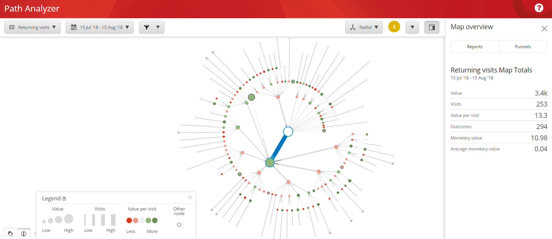
The following screenshot shows a map in radial mode.

Paths provide you with information about how efficiently your website works. This information can give you insight into which content generates the highest engagement value, and which content is not performing as efficiently as it could.
Path length refers to the length of the connecting line between nodes. Path length signifies the amount of traffic that the node receives. The longer the shaded portion of the path between nodes is, the more traffic that particular node receives. For example, a node that receives a lot of traffic but does not generate much engagement value is a candidate for closer examination and optimization.

You can measure the efficiency of your website using Path Analyzer maps. On a map, the nodes along the map show you the relative engagement value for that particular page. Nodes range in color from dark red to dark green. The greener the nodes along a path are, the more efficient the path is at generating engagement value. A path containing red nodes indicates that the pages generate low engagement value and could be candidates for optimization.
Another key to understanding path efficiency is node size. Node size increases as the engagement value generated by contacts who pass through the node increases. For example, you could view a Path Analyzer map that has a high traffic path with dark red nodes. This would indicate that the path received a lot of contact traffic, but had low engagement value levels. You could see that other paths that contained certain types of pages, such as employee biographies, lead to higher conversion rates than the more frequently used paths.
By examining what works on your website and then steering visitors towards the most efficient paths, you have a greater chance of generating more engagement value. This helps you make your website and your marketing strategies more efficient.

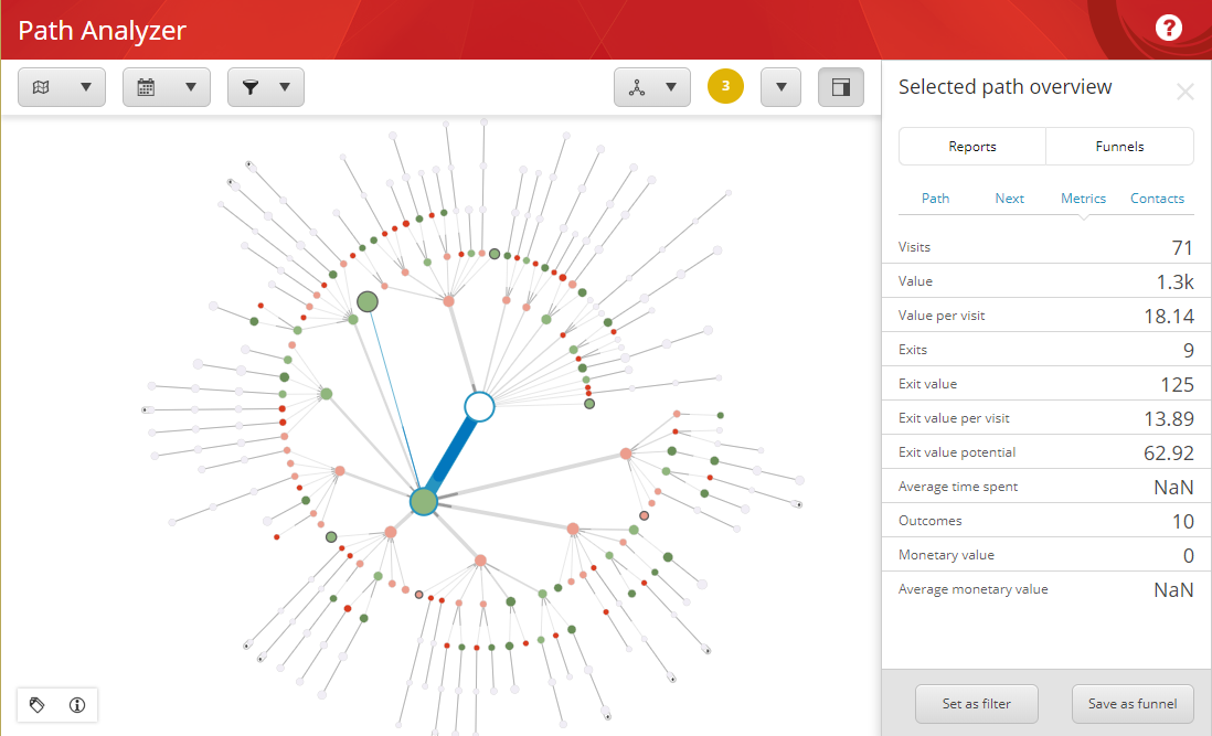
In a pane to the right of the Path Analyzer map, you can view analytics details. On the Reports tab, you can view different types of Path Analyzer reports.

The Metrics panel contains the following categories:
Item | Description |
|---|---|
Visits | The number of visits to this path. |
Value | The sum of the engagement value points accumulated by contacts who have visited this path. |
Value per visit | The average engagement value points per visit to this path. |
Exits | The number of contacts that left the website at this node. |
Exit value | The sum of the engagement value points that contacts have accrued before exiting at this node. |
Exit value per visit | The average engagement value points per visit of contacts who exited the website at this node. |
Exit value potential | The engagement value a path could potentially gain through optimization. |
Average time spent (sec) | The average amount of time contacts have spent on a node. |
Outcomes | The number of outcomes realized on this path, including outcomes from descendant nodes. |
Monetary value | The total monetary value gained on this path. |
Average monetary value | The average monetary value gained on this path. |
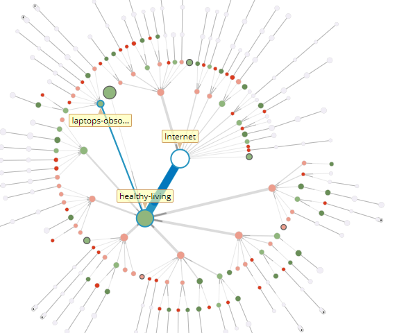
If you have not selected a node within a path, the Metrics panel will show information about the Internet root node. To select a new node, hover or click on it. This will show analytics information, such as visits and value, for both the node and the path leading up to the node.