The grid settings
The SXA grid definition, its settings, and classes.
Grid systems help you create responsive websites that have consistent designs and ensure cross-browser support. Understanding how the SXA grid layout works provides you with an insight into how to use and change grid settings, and how to add classes.
This topic describes:
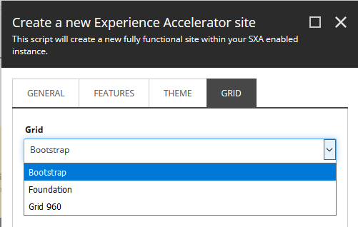
By default, SXA comes with three grid systems:
Bootstrap – responsive, mobile-first grid system with a 12-column layout that includes predefined classes. Default devices are:
Phones
Tablets
Desktops
Large desktops
Foundation – responsive, mobile-first grid system with 12-column flexible grid that can scale out to an arbitrary size. Default sizes are:
Small
Medium
Large
Grid 960 – 12-column grid, based on a width of 960 pixels. Default settings are:
Size
Prefix
Suffix
Note
All grid systems have different system rules, classes, and options. For more detailed information, refer to the different grid systems own documentation.
You can select a grid system when you create a site.
 |
Note
If you do not select a grid during the site creation process, by default the Bootstrap grid is applied.
In the site Settings folder (Sitecore/Content/Tenant/Site/Settings), in the Grid section, in the Grid Mapping field, you can map devices to a specific grid system. For example, you can use the Grid 960 system for mobile devices:
 |
Note
It is important to be aware that changing the grid system after you create your site requires many manual changes. Because of the references on your pages to the previous grid system, making a change to the grid system will break your layout.
Grid systems are stored as a feature in Sitecore (sitecore/System/Settings/Feature/) and include:
The Grid Definition item – includes all grid system specific items (the devices and their classes).
The Grid Setup item – the scaffolding item to include the grid in the drop-down list of the Create a new Experience Accelerator site wizard.
The Grid Definition item includes all grid system specific items that a content editor can use in the Experience Editor.
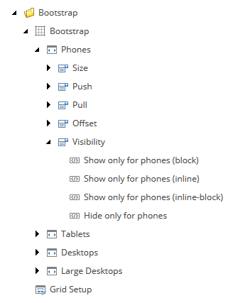 |
The following fields are included in the Grid Definition item:
Field | Description |
|---|---|
Name | The name of the grid system as you want it to display in the site creation wizard. |
Rendering parameters field type | Determines the way the grid parameters are rendered. |
Default component layout | Sets the default column size for renderings that you drag on the page. |
Grid theme | Links to the theme used for the grid. |
Grid field parser type | Determines the parser type to parse the grid fields. |
Grid body view path | Defines the body layout of a page. |
Flex | List of CSS classes that determines the way placeholders behave when they are not set to a fixed size. For example, |
Fixed | Set of CSS classes that determines the way placeholders behave when they are fixed. For example, |
Visibility classes | Classes that let you show or hide elements based on screen size or device. For example, for the Foundation grid system: |
The Grid Setup item includes the following fields:
Field | Description |
|---|---|
Name | The name of the grid system as you want it to display in the site creation wizard. |
Dependencies | Lets you determine the order in which the features are installed. |
Grid Definition | Refers to the Grid Definition item. For example, for the Foundation grid system: Settings/Feature/Experience Accelerator/Foundation/Foundation |
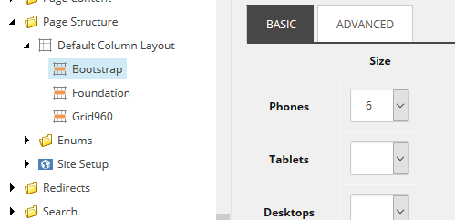
You can change the default settings of the columns for each grid in the Page Structure folder (sitecore/System/Settings/Feature/Experience Accelerator/Page Structure/Default Column Layout):
 |
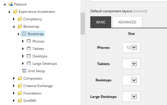
You can change the default layout settings of the renderings in the grid definition item of the grid system. For example, for the Bootstrap grid (sitecore/System/Settings/Feature/Experience Accelerator/Bootstrap):
 |
The classes defined in the Grid Definition item correspond to the grid system details in the Media Library. For example, in the Experience Editor, you have the option to hide a rendering for visitors using a large desktop.
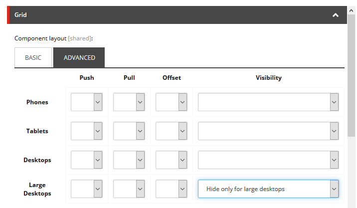 |
This option is set in the Visibility settings of the Bootstrap grid system (sitecore/System/Settings/Feature/Experience Accelerator/Bootstrap/Bootstrap/Large Desktops/Visibility/Hide only for large desktops):
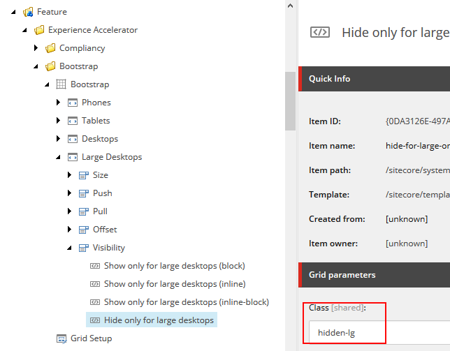 |
This class is taken from the bootstrap.css file loaded in the Media Library (sitecore/Media Library/Feature/Experience Accelerator):
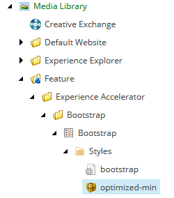 |