Walkthrough: Adding search functionality to your page
How to use and configure search in SXA.
To enable visitors to quickly find what they are looking for, SXA comes with flexible out-of-the-box search functionality. There are different search renderings available from the Toolbox, for example, renderings that add a search box, renderings that sort or filter the search results, and so on. This makes it easy to set up a simple search solution for your site.
For example, you can add a basic search solution to your page that contains a search query box and lists the results with pagination.
This walkthrough describes how to:
To enable your visitors to search your site, you can add a search box to your pages. By default, the Search Box rendering adds the search text box to the page. You can customize the search box by configuring the item and changing the properties.
To add a search box to your page:
From the Toolbox, drag the Search Box rendering to the page.
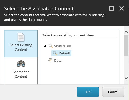
In the Select the Associated Content dialog box, for the search box, select the Default item.

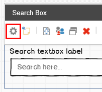
To change the text of the search box on the page, in the Search Box toolbar, click Edit component configuration item
 .
. 
In the dialog box, edit the following fields and click OK:
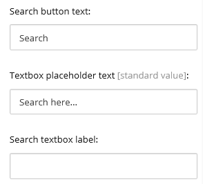
Search button text – the text of the rendering's button.
Textbox placeholder text – the text in the search box that functions as a hint to describe the expected value.
Search textbox label – a title for the search rendering.
For example, the following fields:

Display the following search box on the page:

Note
If you leave the Search button text field empty, the button does not appear on the page.
To change the Search Box rendering properties, for example, to add a search scope or tips for words to search on, in the SearchBox, click More, and click Editcomponentproperties:

In the Control Properties dialog box, for basic search solutions, you can leave the default values. For more complex solutions, you can edit the following fields:
Search results signature – enter the unique signature of a specific Search Results rendering to limit the search results. This can be convenient when you have more than one search result rendering on the page.
Target signature – if you created a separate search results page, enter the signature of that page here.
Searchscope – select a scope to limit the search results.
Max predictive results count – sets the maximum number of predictive results shown in the drop down. When you leave this field empty, no predictions are shown.
Search results page – select the specific search page, if you want to direct to a separate page.
Show search textbox – selected by default. Clear to remove the search text box.
For users to view the results of their search, you must add the Search Results rendering on the page. For simple solutions, you can have the search results appear on the same page.
To add the Search Results rendering:
To add a search results section to your page, from the Toolbox, drag the Search Results rendering to the page.
To change the text of the search box on the page, in the Search Results toolbar, click Edit component configuration item
 and enter the text that you want to appear when the search returns no results. Click OK.
To change the Search Results rendering parameters, for example, to determine how many results should be loaded at once, or how the results are sorted, in the Select the Associated Content dialog box, select the Default item.
In the Control Properties dialog box, edit the following fields to specify how to arrange the search results:
Search results signature – enter the unique signature of a specific Search Results rendering to limit the search results. This can be convenient when you have more than one search result rendering on the page and you only want to filter on specific search results. When you leave this field empty, it will filter all Search Results renderings with no signature.
Search scope – select a scope to limit the search results.
Page size – enter the number of results you want to be loaded by the rendering.
Default language filtering – select the language you want to use for the search.
Default sort order – select the way the results are sorted on the page. This is only used when the Sort Results rendering is not used.
With the Page Selector rendering, you can determine how to display the results pages. The number of pages displayed depends on the default page size configured in the Search Results rendering or, if the Page Size rendering is used, on the page size configured in the Page Size rendering.
To add the Page Selector rendering:
From the Toolbox, drag the Page Selector rendering to the page.
In the Page Selector toolbar, click Edit component configuration item
 .
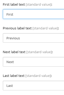
.In the dialog box, fill in the fields and click OK.
For example, the following fields:

Appear as:

To change the properties of the Page Selector rendering, for example, to determine how many pages are displayed in buttons, in the SearchBox, click More, and click Editcomponentproperties.
In the Control Properties dialog box, edit the following fields and then click OK:
Search results signature – if you want to filter on specific Search Results renderings, enter the signature(s) (separated by a comma) of the Search Results rendering(s) that you want to search on.
Collapsed mode threshold – if you expect results on many pages, you can replace some of these pages by dots.
For example, if you enter 10 in the Collapsed mode threshold field:
 |
The following is displayed for the search results:
 |