The Dashboard tab reports
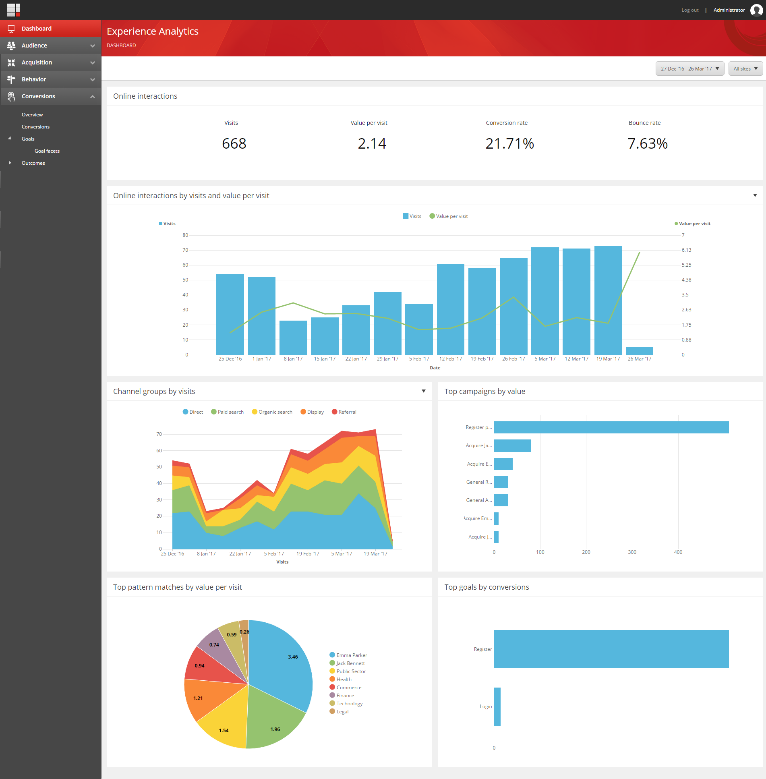
The Dashboard tab contains reports that provide an overview of the most popular reports in all of the tabs.
In the Experience Analytics dashboard, to help you identify general marketing trends on your website, the Dashboard tab contains reports that gather the most important performance indicators from all of the other tabs.
Note
The tabs can contain duplicate reports showing the same data presented in a different way. For example, in a graph and in a pie chart. This topic does not describe each duplicate report.
You can find detailed technical information for every report, including duplicate reports and drill-down information, in the Sitecore Experience Analytics Standard Reports document.
The Experience Analytics glossary of terms can also help you to understand the reports.
Tab | Reports | |
|---|---|---|
Dashboard Shows an overview of the key analytics reports on the Dashboard tab.
| Online interactions A summary of key metrics of your entire website, showing visits, value per visit, conversion rate, and bounce rate. Online interactions by visits and value per visit The number of visits your website has received within a specified period, as well as the average engagement value generated per visit. Channel groups by visits The channel groups with the highest number of visits to your website. Top campaigns by value The campaigns that have accumulated the highest number of engagement value points during visits. Top pattern matches by value per visit The pattern cards that contacts have matched with, and that have provided the highest average engagement value generated per visit. Top goals by conversions The goals that have generated the most efficient high-value visits on your website. |
